I love the history of sports team nicknames. Today I am sharing some of the stories behind the nicknames of five NBA teams. Some of these stories are complicated as about half the league has had at least one relocation and/or name change. Other teams are very straightforward and simple. But we are going to do it division by division. You see, there really isn’t a good way that we can fit all 30 teams into a single episode. So, going division by division seemed the best way to give each team adequate time.
In today’s episode, we are going to cover the Pacific Division. We will return to this topic about once per month or so as we cover each of the other five divisions in the NBA.

Golden State Warriors
The first team on our list today is the Golden State Warriors. The Warriors are one of only three original teams still playing in the NBA, along with the Celtics and Knicks. The Warriors were part of the very first season of the league and the very first champion.
They began their NBA life as the Philadelphia Warriors and they named themselves after an earlier team also called the Philadelphia Warriors that played in an older league back in 1925. They wanted to go back to the history of basketball in the city of brotherly love. As a side note, the name Philadelphia comes from the Greek word, Phileo, which literally means the love of a brother, as opposed to the love of a parent or romantic love. So Philadelphia actually means the city of brotherly love, which is why it carries that nickname.
Now back in the 1940s when the Warriors were a brand new team, things were not as politically correct as they are today. The name Warriors was a Native American reference that gave off the image of toughness and ferocity. At least it was supposed to.
But, before anyone gets triggered, I’m just reporting how things were back then, like any good journalist would. Their original logo featured a cartoon of a smiling Native American with a feather in his hair and dribbling a basketball. And this went unchanged for 16 years.
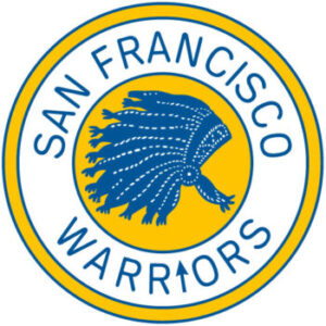
The team then moved to San Francisco in 1962 and became the San Francisco Warriors. The logo changed to just a Native American headdress surrounded by the words San Francisco Warriors. They played in a building called the Cow Palace because its primary purpose was to host livestock shows. I’ve actually been to the Cow Palace. I saw Nirvana play there back in 1993. Anyway, the Warriors played there for a few years.
Then in 1970, they moved across the bay into the then brand-new Oakland Coliseum Arena where they played until just a year ago. And when they moved to Oakland they changed their name to the Golden State Warriors. They removed all references to Native Americans. Their logos have since featured the Golden Gate Bridge, a cable car, the silhouette of the state of California, and for a few years in the early 2000s, some sort of lightning bolt man.
He looked like a blue version of the character Snake Eyes from G.I. Joe, but he was holding a lightning bolt. That character was so inoffensive and generic that nobody liked it. As for the Golden State part of their name, they wanted to be the team for all of California, and California’s nickname is the Golden State. But, if you’ve been to California you won’t find too many fans outside of the San Francisco Bay Area since California has 3 other NBA teams. We are going to talk about one of those other California teams right now.
Los Angeles Clippers
Next are the Los Angeles Clippers. They entered the NBA in 1969 as an expansion team in upstate New York, right on the Canadian border. They were called the Buffalo Braves. They also chose a Native American nickname for the same reason everyone else did back then. They wanted an image of toughness.
Their first logo was the letter B with a feather on it. They also used a new logo that was a basketball wearing a feathered headdress with a picture of a Buffalo in the middle of the basketball. In 1975 they had the only MVP in franchise history, Bob McAdoo.
But, after nine relatively unsuccessful seasons in Buffalo, they decided to relocate the franchise to San Diego where they would pick a new name and completely ditch anything having to do with Native American imagery. If you have ever been to San Diego you know that in the bay you will find these huge historical wooden sailing ships known as Clipper ships.
They are from the 1800s and they are really cool to look at especially when they take them out into the water. If you did not know any better you would think that San Diego was under some sort of pirate attack. They have a bunch of these. But these ships are actually merchant ships built for speed. For their length, they are quite narrow with huge sails so that they could travel as fast as possible.
They are an amazing sight worth seeing if you ever get a chance to visit. So with that history in mind, the team went with the name the San Diego Clippers and had this whole nautical theme going. On their shorts, they used to spell out the word Clippers in those nautical flags that correspond to different letters in the alphabet.
Then in 1984, they decided to move up to L.A., where they kept the name Clippers even though the ships the name was based on were still back in San Diego. Their logo was simple. It was a basketball with the words Los Angeles Clippers on it. Lately, they have used the letters LAC in a rectangle shape, or the word Clippers with a basketball on top.
I think it would be cool if their logo went back to the nautical theme and had one of those huge ships with a picture of a basketball on the main sail or something. But, now we are going to head down the hall to visit the other team that shares the same arena with the Clippers.
Los Angeles Lakers
That team is The Los Angeles Lakers. They joined the NBA in 1948 as the Minneapolis Lakers, because, after all, Minnesota is the land of 10,000 lakes. The word Laker is either a reference to a lake trout or the ships that carried cargo across the Great Lakes. Either way, it was a name specific to Minnesota. Their original logo was a basketball with the state of Minnesota on it. Around that were the words Minneapolis Lakers.
In 1960 they decided to move out to Los Angeles, but kept the name Lakers since it sounded cool.
Both their new city and their nickname started with the letter L. Never underestimate the power of alliteration. They have used the same logo virtually the entire time they have been in California. It is a basketball with the words Los Angeles Lakers on it. Simple and straightforward.
They changed their color scheme a few times. Back in Minneapolis, they were powder blue and yellow. Then, when they first arrived in Los Angeles, they used light blue, dark blue, and white. And then in the mid-1960s they switched to their current purple and gold.
Phoenix Suns
Now, we move west across the state line to Arizona. There we meet The Phoenix Suns. They are the only team on today’s list that is not in the state of California. They are one of those teams that have never moved and never changed their name.
They were a brand new expansion team in 1968. And this was big because the Suns were the first major professional sports team in the entire state of Arizona. The state was now in the big leagues and they could not be happier about it.
So, they wanted a name that would capture their year-round sunshine and desert surroundings. Some of the other names that made the final list were Tumbleweeds, Rattlers, and Scorpions. I think those are all cool names and would have served the franchise just fine. If they had been the Phoenix Scorpions I would say, yeah, that is a perfect name. But in the end, the winner was the Suns. Their orange and purple color scheme represents what a desert sunset looks like in Arizona.
If you have never been, it is absolutely gorgeous. Honestly, the desert is not really my thing, but the sunsets are amazing. Their logo has always been some version of a basketball with fire or rays of sunlight coming out of it. At one point their logo was a basketball with a Phoenix made of fire rising out of it.
In my opinion that was their best logo. There has never been a need to change it. I always love it when a team’s nickname perfectly captures the location they play in.
Sacramento Kings
That takes us back to California and the final team for today. That team is the Sacramento Kings. This team has moved around quite a bit but has always maintained a majestic nickname. They joined the NBA in 1948 in upstate New York and were known then as the Rochester Royals in Rochester, NY. Their original logo featured a shield with the words Rochester Royals on it to continue that regal theme.
Then in 1957 they moved to Cincinnati, OH, and became the Cincinnati Royals. Their logo was a basketball wearing a crown. Sometimes the basketball had a smiling face on it. The team had a lot of success in Cincinnati as they had Oscar Robertson on the team for most of that time.
Then in 1972 they moved west and became the Kansas City-Omaha Kings.
They changed their name from the Royals to the Kings to avoid confusion with the Kansas City Royals baseball team, which was already playing there. They also used two home cities as you can tell from the name Kansas City-Omaha Kings. They actually played half of their home games in Kansas City, MO, and half of their home games in Omaha, NE. Keep in mind that these cities are about a three-hour drive from each other. It is very tough to have two home cities like that.
After three years of that, they decided to make Kansas City their only home and became just the Kansas City Kings. They used a blue and red color scheme but kept the logo of the basketball wearing a crown. But now it was more stylized.
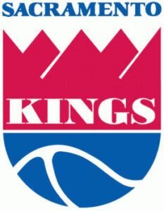
Their final move, so far, was in 1985, this time to the state capital of California, the city of Sacramento. And there they became the Sacrament Kings. Here their logo has changed a little bit. Most of the time they kept the basketball with the crown on top, but they have also used a logo featuring a shield with crisscrossing swords and the word Kings on it.
Their color scheme is primarily purple now to go with the regal theme. They sometimes use a lion logo, because as you know, the lion is the king of the jungle. And seeing as they are the only sports team in town, they have massive fan support.
Wrapping Up Pacific Division
So, that covers the Pacific Division. As I said at the top we will do this again about once a month as we make our way through the entire league.
In our next post, we talk about the first player to go from high school directly to the NBA back in the 1970s and how that player caused the league to change an essential piece of equipment.
More From Basketball History 101
History of NBA Team Nicknames: Pacific Division
I love the history of sports team nicknames. Today I...
Read More
Cheryl Miller – Greatest Women’s Basketball Player of All Time?
Imagine that you are one of the most skilled people...
Read More
Senda Berenson and The First Women’s Basketball Game
The very first women’s game recorded happened only one year...
Read More
The Mad Russian: Tom Meschery’s Extraordinary NBA Career and Unforgettable Life Story
Tom Meschery was one of the great players in Golden...
Read More