I love the history of sports team nicknames. Today I am sharing some of the stories behind the nicknames of five NBA teams. Some of these stories are complicated as about half the league has had at least one relocation and/or name change. Other teams are very straightforward and simple. But we are going to do it division by division. You see, there really isn’t a good way that we can fit all 30 teams into a single episode. So, going division by division seemed the best way to give each team adequate time.
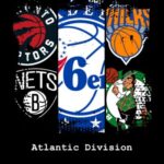
Today’s story is actually five stories on how more NBA teams got their nicknames. With so many teams to go through, we are going division by division. We already did the Pacific Division, so if you want to read that one, go back through the posts to find it. So, here we go with the Atlantic Division.
LISTEN ON YOUR APP OF CHOICE

Boston Celtics
The first team on our list is the Boston Celtics. The Celtics are one of only three original NBA teams still playing today. They are also one of those teams that have never relocated and never changed their nickname. They have always been the Boston Celtics.
They began life in the NBA during that very first season in 1946. They lead the NBA with 17 total championships, tied with the Lakers for the most in league history. Their original owner, Walter Brown, was responsible for naming the new team. He toyed around with names like the Whirlwinds, the Olympians, and even the Unicorns. But in the end, he felt inspired by an old team from New York known as the Original Celtics.
It was a name that already came with a sense of tradition and success. In the words of Walter Brown, “Boston is full of Irishman.” The Irish theme has always played well in Boston. Their logo has had a few updates over the years. The original logo was a shamrock with the word Celtics on it. Later, it was changed to a leprechaun leaning on a shillelagh with one hand and twirling a basketball with the other. It is classic and it works.
Even their uniforms have gone virtually unchanged. They have always been green and white with either the word Boston or the word Celtics on their jersey. They have used a few alternate uniforms in the last decade or so, as the NBA is encouraging teams to use alternate uniforms to boost jersey sales. But, their primary uniforms maintain a classic look that works in any era.

Brooklyn Nets
Our next team is the Brooklyn Nets. They started life in the old ABA as the New Jersey Americans in 1967. It is a name that only a true patriot could love. But, this name only lasted one season. The next season they moved to New York and became the New York Nets.
It is not a very creative name. They thought it was fun that their name rhymed with two of the other teams in New York; the Mets of Major League Baseball and the Jets of the AFL, the American Football League. So there you have it, the New York Nets, The New York Mets, and the New York Jets.
Their original color scheme was red, white, and blue. They won two ABA championships when they were led by none other than Dr. J, Julius Erving. They actually won the final ABA championship before the two leagues merged. But unfortunately, they are still looking for their first championship as a member of the NBA.
They played one season in the NBA as the New York Nets, but then decided to move on to greener pastures and relocated back to New Jersey where they became the New Jersey Nets. Their original logo was the words New Jersey Americans on a red, white, and blue banner. After that, their logo was a basketball with the words Nets on it. Then it was a basketball with the word Nets above the ball.
For a few years, it was a silhouette of the state of New Jersey above a basketball. They were all fairly pedestrian logos. Then in 2012, they moved back into New York City, specifically to the borough of Brooklyn where they are today as the Brooklyn Nets. Their color scheme has changed to a simple black and white. Their logo is a basketball with the letter B on it.
It looks like it came from the 1940s and I mean that in a good way. It is a classic and simple logo. It really looks nice.

New York Knickerbockers
Since we are already in New York, let us move over to the island of Manhattan where we find the New York Knicks. They are also one of those teams that has never relocated and never changed their name. They, along with the Celtics and the Warriors are the only three original teams still playing in the NBA. Their full name is the New York Knickerbockers.
So, what is a Knickerbocker? In order to answer that, we have to go way back in history. British settlers named the city after Yorkshire, England. So, they had old York back in England and this series of islands on the Hudson River would become New York. But before that, the place had been named by Dutch settlers and the place was known as New Amsterdam. So the name harkens back to the Dutch roots of the city.
You see, knickerbockers were those short pants that stopped just below the knee. They were also known as knickers for short. They were quite fashionable in the 1600s. So the team that plays in the famous Madison Square Garden was named after an article of clothing, an old-fashioned style of trousers. Their original logo featured a cartoon of a Dutch settler dribbling a basketball. But since 1964 the logo has been some version of a basketball with the word Knicks above it.

Philadelphia 76ers
Now we travel down the New Jersey turnpike to Philadelphia where we meet the 76ers. They joined the NBA in 1949 as the Syracuse Nationals from upstate New York. They started in an older league that went out of business and saw the opportunity to join the more established NBA. The name Nationals was a reference to America.
The Nationals were “of the Nation.” But after playing in Syracuse for around 15 years they were looking to move to a larger city where they could make more money. In 1961 the Philadelphia Warriors decided to move to California, which meant that Philadelphia was available. The following year they pulled up their tent stakes and headed south.
They also took the opportunity to change their name to something that captured the spirit of Philadelphia. With the Declaration of Independence having been signed by the Founding Fathers in Philadelphia in 1776, what better way to honor that than by renaming themselves the Philadelphia 76ers. They have always had a red, white, and blue color scheme, even when they were the Nationals.
Their original logo was a silhouette of the United States with the word “Nationals” on it. Since moving to Philadelphia they have used a logo of a basketball with the word 76ers on it. For a brief period they used a Liberty Bell logo. But in most of its iterations the logo also features 13 stars in honor of the original 13 colonies that signed the Declaration. It is one of those names that just fits so perfectly with the city where they play.

Toronto Raptors
Now we move north of the border to the only team that plays their home games outside of the United States. I am referring to the Toronto Raptors. They began life in the NBA as one of two Canadian expansion teams in 1995.
The other Canadian team was the Vancouver Grizzlies who have since moved to Memphis, Tennessee. The name Raptors was one of several names that made the final list. But with the recent popularity of the Jurassic Park movies, the Velociraptor, or Raptor, had become a very popular dinosaur among kids.
So, that is what they went with. Even today, the area outside the arena where fans can hang out and play interactive games is called Jurassic Park. Their logo has gone mostly unchanged. It features a dinosaur wearing a basketball uniform and dribbling a basketball.
Their original color scheme was purple and red, but having a purple dinosaur as a logo brought back visions of Barney the dinosaur from the kids TV show. So, now they use red and black, and I think the uniforms look much better.

So there you have it. That is how the five teams in the Atlantic Division got their nicknames. We will come back to this topic approximately once a month until we make our way through the entire league.
More From Basketball History 101
Bill Walton’s Feet: A Legacy of Pain and Progress
How does a player who spent 14 seasons in the...
Read MoreHistory of NBA Team Nicknames: Atlantic Division
I love the history of sports team nicknames. Today I...
Read MoreHistory of NBA Team Nicknames: Pacific Division
I love the history of sports team nicknames. Today I...
Read MoreCheryl Miller – Greatest Women’s Basketball Player of All Time?
Imagine that you are one of the most skilled people...
Read More


